Today or yesterday paragraph tags have popped up in stories. I assume they are wanted to tag where readers are in a chapter or to be used in multiple writer/editor projects. However, when the site is accessed on a phone or tablet, and you scroll with a finger on the page you tag a paragraph every time you scroll. Additionally, it creates a lot of extra space between paragraphs necessitating more scrolls which for a site where one hand is already occupied, kinda annoys. There must be a way to deselect this feature, right?
Hm. That’s funny as this change is actually supposed to solve the problem of placing a bookmark on a paragraph specifically on mobile devices.
Before, it was necessary to touch and hold the finger on a paragraph for at least a second to toggle the bookmark on that paragraph. That was not only quite unintuitive, it also collided with the phone’s own text marking functionalities.
That’s why I decided to add that little icon on the top left corner of each paragraph, the exact spot where the bookmark is shown when active. It doesn’t take any space that wasn’t empty before anyway, so I don’t get why you feel it takes extra space.
Maybe it doesn’t render properly on your device? Could you maybe create a screenshot and post it in here? What device are you using, btw?
Also, you have to hit that little bookmark symbol to toggle it. If you scroll on any other place of the text, the bookmark should not toggle. Is that not working for you? Does it toggle no matter where you touch?
Can’t speak to OP’s experience, but this is how the new function is looking for me (in Safari on iPhone).
Because the icons are now permanently on display regardless of whether they’re “on” or “off” it causes the start of every paragraph to be indented. Admittedly it’s only by a few pixels, but when you’ve got a story with frequent line breaks it starts to feel like you’re reading a bullet point list as opposed to dialogue.
The paragraphs have ALWAYS been indended. That has not changed!
If you log out, you’ll see the layout exactly as it was before the change (logged out users can’t bookmark).
Ah, so they were!
I guess I never noticed them before as being empty space means your eyes jump straight to the text. Whereas now there’s something filling that space it’s temporarily drawing my attention away from the story.
I’m sure I’ll get used to it now I know why the icons are there, but first time I read a story post-upgrade it did like me wondering why the heck the author had added bullet points to everything.
If just uploaded a change which makes them even less intrusive. On Kinky they’re just barely visible now, while on Spiral they’re a bit more eyecatching still.
You might want to move over to Kinky anyway, as there are ALL stories on Kinky, Spiral’s as well as Cupid’s and Collar’s
(sorry, I’m still trying to advertise for Kinky as it doesn’t get the attention I’d hope it would…)
1 Like
I can confirm that I still seem to be experiencing the bug where bookmarks are toggled when scrolling really easily on mobile. This is a bug that has mildly annoyed me for a while, so I for one would love if this new button fixed the issue. Can bookmark toggling any way besides this button be disabled entirely, even if just by a user setting?
I’ll also agree that the button is much less obtrusive on kinky, and that alone is enough reason for me to convert to kinky.
I’m also a big fan of a bookmark button being added to story descriptions on the homescreen! I personally haven’t used bookmarks much in the past but using it as a read later tag is definitely something I’ll use.
Ok, I’ll remove the old logic that toggles the bookmark when touching anywhere on a paragraph for a prolonged time. It has been bothering people way too long.
Heh. That’s my elaborate scheme to make people move over ![]()
That’s what I was hoping. Today I’ve added them to the comments as well, as I think many people might want to read a story later if they saw a positive comment on it.
1 Like
Is there any way to turn off bookmarks entirely? From day one I’ve had the ‘touch the screen get a bookmark’ problem and just gave up complaining about it.
Now there’s a bookmark icon on every. single. paragraph.
It’s visually very annoying and the touchscreen sensitivity means bookmarks everywhere.
The whole site has gotten extremely cluttered and slow to load for me, would really love a simple scaled back version available to people.
I don’t know if this is possible to streamline, or if it would even be helpful, Martin, but for me the barrier that delayed my moving over to using kinky was needing to re-do the login/password. Which in my case involved going into my opera system settings to retrieve the password I was using for Spiral.
I also had to do this when Cupid came out, and then Collar. Our accounts carry over but being logged into one site doesn’t log you into the others, saved passwords don’t recognize the other sites etc.
So while it is a minor annoyance at worst, it was that minor annoyance x3 and I honestly avoided kinky for at least a couple weeks until finally the annoyance of having the home button on the forums taking me to the Kinky page instead of the Spiral page outweighed the annoyance of hunting for my password (again).
I’ve just disabled the old code to toggle bookmarks. So no matter how you scroll, you shouldn’t be able to toggle bookmarks accidentally.
The thing with the bookmark icon on every single paragraph is the exact reason why I didn’t solve it like this in the first place. But, as you’ve seen yourself, the alternative with a “hidden” way to mark a paragraph didn’t work so well.
The icons are hardly visible now. I’ve reduced their opacity further just some minutes ago, so they’re even less obtrusive now. I could turn them off entirely, but again, then no one would know that they’re there and can be activated, which is the whole point.
I doubt that the site is slow to load because of that, as it loads everything asynchronously exactly to avoid any waiting times.
Only right after I’ve uploaded an update to the site to the server, it will be sluggish for a while, as the JIT compiler is still compiling each function as soon as it’s used for the first time.
That will result in a locked screen and a turning circle for a second here and there. But after a while, as every function has been used by some user at least once, this vanishes completely. After that, the performance is actually really good, as I’ve put quite some effort into optimizing it.
I somewhat agree about the cluttering, though. That’s the dilemma between functionality and a streamlined and easy to grasp UI.
One easy way to resolve this would be a special theme that disables any non-essential function and the UI elements with it. I wouldn’t ever use that myself, but I see that some people prefer a simple, uncluttered UI.
Just so I don’t forget to implement this, the best way would be to add an appropriate “Feature Request” in the forum’s specific category. That way I can also see how many people are in favor of such a function.
I’d prefer having a central logged-on session management. As the sites use separate domains, this doesn’t work automatically, as the cookies cannot be shared easily.
Of course this can be resolved using some REST calls to a shared domain. It makes things even more complicate and introduce another thing which can fail. So I avoided this so far, as I figured it shouldn’t be THAT difficult to login once on each page…
Until like about a year ago, login-sessions times out after a couple of weeks and you had to log in again all over again. That was way worse… ![]()
1 Like
Thought the icons were looking even less obvious this evening! Thanks for continuing to work on these to try and get to the right balance, Martin
2 Likes
Thank you Martin for your quick response and willingness to discuss the issue. And your fix is a happy solution.
1 Like
Would it not be easier to just remove that bookmark system? Who is bookmarking individual paragraphs in porn stories instead of the story itself? It’s not like these are 1,000 page novels where your place is hard to find.
If we’re voting for features can we get a say in voting to NOT have them implemented in the first place? Actually nah forget it, that’d require either being constantly on the commenting forums (I’m here for the well written porn not the conversation) or have yet more top-of-the-page banners informing us of random feature implementations or contests. It’s a lose-lose for anyone who does want a simpler, easier experience.
The solution of having a ‘special’ theme to avoid the janky rollout of questionable-value features has really soured me on this place. There’s only grudging admission that maybe, just maybe, some people don’t like layers on layers of visual crud and intrusive eye catchers every time.
Well, I use bookmarks on paragraphs.
Quite often. Every time a story is too long to read in one session. Especially if the session comes to a certain biological end ![]()
The fact is, that the recent change on the bookmark system has been done because I was contacted by a user who complained that he couldn’t set bookmarks on paragraphs anymore. It turned out that my logic for touch-screens, while working on Android and IOS, failed on Windows Surface devices.
This complaint was the actual incentive to finally get rid of that “hold click for a while” logic, which was never a good idea. But it also means that this functionality is used out there, it’s not “just me”.
Please don’t assume that just because YOU don’t need a function, nobody else will appreciate it either.
I don’t want to be unfriendly here, as I appreciate every single user. But you seem to assume that your idea of how the UI should look like is objectively the only correct one.
My idea of offering options to make it possible that people can customize their user experience (within reason!) is the best I can do to accommodate the different preferences of people. That this approach actually “soured you on this place” is really mind-boggling to me. It looks like you expect your view to be the only correct one that has to be followed, and other people’s opinion doesn’t matter.
Sorry if I read you wrong.
2 Likes
You can be as unfriendly as you want, it’s your site.
I don’t want to be unfriendly, I want to be constructive. And I appreciate that in people talking to me, too.
2 Likes
Constructive is a bit difficult because the features being implemented are simply straight up annoying and un-useful to me personally and the responses feel more along the lines of ‘Well sorry you feel that way but I personally love it’.
I can’t speak for anyone else, just myself, and the features being implemented (endless front page scrolling for example, a super bad anti-pattern, or having multiple overlapping-content sites under the same banner) are unpleasant, intrusive, unwelcome and never reconsidered. Just ‘tuned’.
On top of that… I’m not here for the social aspect, at all. But that’s the way to engage about features that annoy or inconvenience, so if I’m forced to say more than ‘Bad experience pls provide option to revert’ then it comes out pretty abrasive. But to me, the responses here are so massively passive-aggressive that obviously we’re not working from the same book.
What is a “super bad anti-pattern”?
You are aware that you can use GSS the way it was before? That’s the whole reason I didn’t just change GSS but added separate sites next to it.
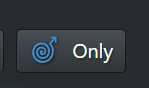
You can choose yourself whether you want to stick to old GSS, get more variety on the new sites, or even all the stories in one place (on Kinky every story is listed). And you can turn off the overlapping of stories, too, if you don’t like that. That’s what this button is for:
The idea of this was to accommodate everyone, to expand the scope of our stories, but NOT to destroy the existing GSS experience in the process.
But it seems instead of trying to understand the concept you went right into “everything is shit” mode.
Why don’t you just bookmark the old home page then? That’s the exact reason why I added it just the way it was:
All Series - Gay Spiral Stories
(can be found under Content->All Series and Stories). There you got the old experience.
It drills down to this that you rather have a different, more conservative handling of the site and that you want to see as little change as possible. That’s fine, every person is entitled to have his own preferences.
What I’m not happy with is that even though I try really hard to accommodate everyone, you ignore the options but just start to complain even though you can still get everything just the way you want.
Telling ME that I’m abrasive and “passive-aggressive” is kinda funny, tbh. You should start to read your own comments from time to time. And put yourself into my shoes. I agree, you’re not passive-aggressive, you’re plain simply aggressive, period.
Especially since I don’t owe you anything. It’s exactly the other way round.
By the way, a good way to discuss ideas of how GSS should look and become better would be the Discord server. Because there you can see how other people are thinking and you’ll get a more immediate response.
2 Likes