I’m a decent programmer and I can design a user interface, but I really suck at creating any kind of graphics and logos.
I’d like to give GSS some kind of logo, for the forum and for main page. That includes the site’s banner. I like the slick and simple design it has right now, so I’d like to honor that.
If you think you could help me out with that, please reply to this posting. Any assistance would be greatly appreciated!
For starters you have to give more info about what you want about the logo, I mean, simple and slick, that’s cool, but what do you wanna express with the logo? What’s message? Any color, any text, ext.
Hugh built the site with the Bootstrap design in mind, so I think we have to find something that matches with the Bootstrap color palette … that doesn’t necessarily mean that the logo has to be blue, but it should match and should not be an eyesore on the site.
For the contents of the logo…Well, given the name and theme of the site, a spiral springs to mind immediately … (pun intended). Maybe combined with an eye? Like a spiral superimposed on an eye? Something like that.
I don’t know if there’s a good way to add the “gay” part to the logo. Using rainbow colors would be the obvious choice, but that could ruin the design.
Let’s brainstorm a bit, maybe some of the others users have some ideas as well?
As for the gay part, if the logo has the name of the site, the rainbow is not necessary. The eye with the spiral is not that bad but aside from the design, you have to think where you wanna use the logo (which part of the site) and what size would have. 200 x 200px is no the same as 200x500px
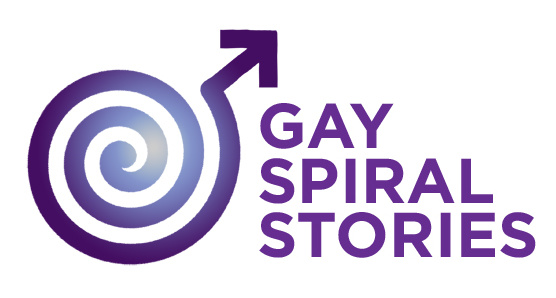
I prefer the first option, feels more natural, and the first typography. The second font looks too much for childish theme and the last one has the problem that it does not go well with the logo, giving the idea of two separate things. An other variation would be with the Spiral on top big, and down the “GSS” You can add an slogan if you want too. Buts that my opinion.
About the reason why I don’t think the second spiral works is because its too big, too many lines and when you reduce the size, its get worse. And the fonts used get lost or does not bond well.
I agree with Uchiha in that I prefer the left logo. While the right one has a nice “hypnotic” effect, it need to be in the correct size to show properly. If see it from some distance, it looks like a disc.
The first font is the best suited among these.
Maybe we can find some background? And I still like the idea of an eye …
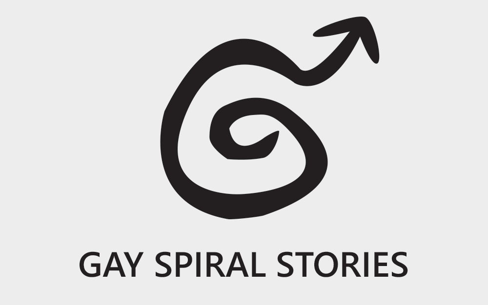
Rainbow is probably a stupid idea. The male symbol in the spiral is much better actually.
About the sizes: I need a browser site icon (16x16 if I’m not mistaken), an icon for the forum banner (40x40) and I’d like to replace the headline on the main page as well.
hmm
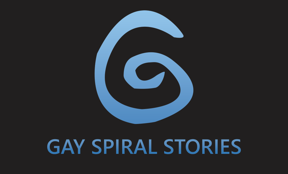
I’m not very skilled with photoediting programs, do mostly traditional art. But for the eye…could we have the spiral be the iris of the eye? That might be a good way to combine them, but that might make the little shape for the ‘male’ symbol tough.
Personally I really like that one, @Cris_Kane
I like the eye as well but seeing it, I do see the similarities to Time Warner and that could maybe conflate it for some people. We definitely need something to be unique, I think.
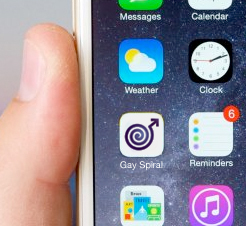
I really like all the logos, and all of the ideas. One thing I found that made it difficult to use logos in general was the amount of screen real estate it took up on phone screens. Over 50% of the site’s traffic is from tiny little phone screens
To get it to really work, you need at least five sizes, if not more, for a variety of screen sizes and ratios.
Just some food for thought. No one is discussing that and it’ll come up the minute Martin goes to implement any of this.
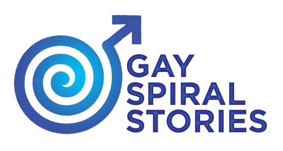
If Martin wants to use or adapt any of the ideas I’ve posted, I’ll be happy to make them work for whatever sizes he needs. The nice thing about the thicker spiral symbol is that it’s still readable even when it’s shrunken down to the size of the characters in the name.
I really like that logo! So it’s decided. Thank you Cris!
What’s the font you’ve been using? Do you have the spiral in vector form? Then I could create any variation I need myself (provided I’ve got the right tool to understand your format).
If it’s a common font, I’d like to render it as text on the main page next to the logo.
The version with the three lines stacked is well suited for the forum page. And the pure logo for the favicon (which is 16x16 and 32x32, a 64x64 version would be nice, too).
For the main page the banner should be around 80px high. So you think it’s a good idea to place it there without any background or framing? I’m afraid it would look a bit lost…
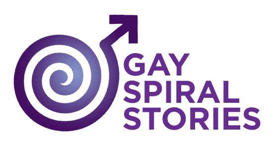
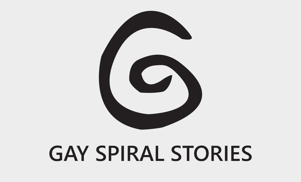
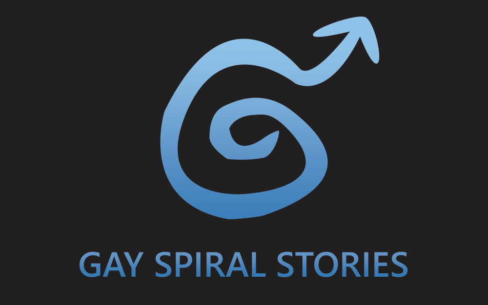
I realize you just decided on going for that logo, but I thought creating a spiral logo would be an interesting challenge, so I gave it a shot. My main idea was to have the spiral resemble a G. I also liked Cris Kane’s version, and idea, so I made a second version inspired by that one.