Just wanted to throw in my two cents and say I’m loving the new recommended feature too! I’ve found new stories I didn’t know I hadn’t read by authors I love and I’ve noticed an increase in people reading my own work too. I think sometimes unless people specifically searched for them, once stories are off the main page they could go unnoticed. Now, they can be brought back up and people will read them more often. All around great change!
1 Like
That was the exact argument I used when I mentioned the idea to Corin. I saw my stories being completely ignored after a few days, even by readers who usually look at my stuff.
4 Likes
Hiii! Just saw that I can easily access my Bookmarked stories from the main page!! ![]() Thank you so much! You don’t know how convenient this will be! Haha
Thank you so much! You don’t know how convenient this will be! Haha
I hope other people can get to know these features, because it’s really useful, especially these days when new stories go down the bottom so fast. It’s so good to be able to “save for later” and then to “choose from bookmarked” once it’s more convenient or want advice from your past self ![]()
Thanks once again!!
3 Likes
Must agree, there loads of stories from years ago that I had forgotten I had started reading or in the process of re reading . Brilliant addition @Corin ![]()
2 Likes
I’ll have to own this one. I was looking a couple days ago and again today. It does look like I may have been tricked by the green and blue checkmarks. Although, I do think I have read one of them I saw all the way. Do you have to scroll to the bottom of a page to say it was read? I’m just curious. I know I have started some before and it didn’t show that I read any % of the story. I’m not criticizing at all to be clear too. I’m just curious as I’ve wondered some things for a long time and this can be an opportunity for me to learn more and use the site differently. Thanks for all the things you keep doing for the site and everyone who is interested in these things.
Ok, some clarification about the checkmarks:
- Filled blue on a chapter: Rated the chapter
- Hollow blue on a series: Rated some chapters, but not all
- Filled blue on a series: Rated all chapters (except the latest one on the ‘New’ view, an indicator that there is a new chapter out in a series where you’ve read all previous chapters)
If the marks are green instead of blue it means you’ve just read the chapters, but didn’t actually rate them.
And yes, for a chapter to count as “read”, you have to spend some time on it and scroll all the way down. Just opening the story doesn’t count. You really have to scroll down at a somewhat realistic speed (at 2500 words per minute, which would be crazy fast reading). You see that the system has counted your reading when the rating tab opens up once you’ve reached it (this is new behaviour, before that change, a reminder to rate was popping up).
The percentage is only shown if you put a bookmark at a given paragraph. It tells you how far in that bookmark is in the chapter.
Let me know if you have any questions or suggestions how to improve this.
2 Likes
Loving the new feature, very excited to try it out more and very excited the site still recieves such support after all these years. You spoil us.
I like the idea of the list marking a brand new story too, a feaure that happened to me today. However it currently looks like this and I find the story description way too hard to read.
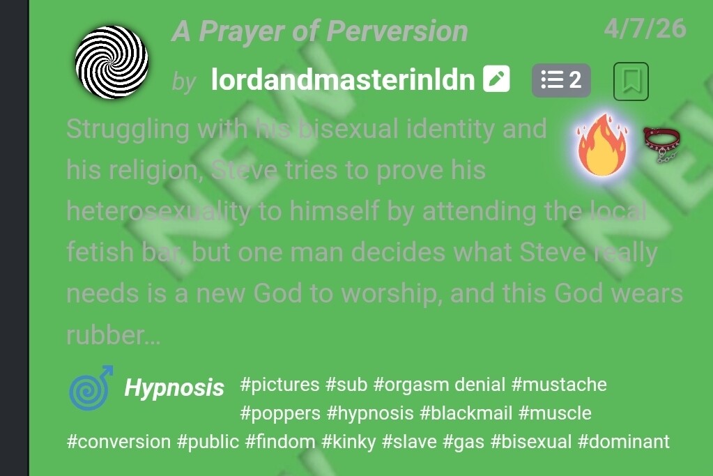
I think you can change the colours in “theme” as on mine it’s a darker green with grey writing that’s more readable ?
Which theme are you using?
“Slate [dark] (default)” on mobile.
This doesn’t look.like intended, the green background is way too bright.
What phone do you have? And which Version of the OS?
Galaxy S26+. One UI 8.5. Android version 16.
Hm. Sounds perfect. Similar to my own.
Ok I’ll investigate it and look for a better way to highlight the new entries. I’m a bit tired of the old way anyway.
Thanks for reporting.
Ok, I’ve changed how new stories and comments are highlighted. I hope this works better for you (and everyone else, too).
My two cents: It’s way too subtle now! I can barely see a difference on desktop/default theme.
Thanks for the input!
Is this a general consent? I wanted to make it a bit more subtle, but of course, it still has to be visible.
1 Like
Yeah on my end it’s also too subtle. Maybe add a small green tag saying “New!” Next to the bookmark button in the titles? That way it doesn’t cover the description. Keeping the green highlight around the edge would probably be good though!
I don’t want to add another element to the title bar, it’s too packed with information already.
I’ve just uploaded an update that increases the green blend a bit.
The main indicator is the green line on the left and the background “NEW” embossed in the background. Is that really too subtle?
That makes sense (about the titles).
On my end I’m not seeing the “new” anymore, only a faint glow around the outside edges (I use slate). I’m not sure if it’s because I already viewed the list of new stories or not, though. Does it clear after you’ve viewed the list? Either way I don’t really mind, I think it looks good if you don’t think anything should be added to titles!
This is how it’s supposed to look like:

If it looks differently for you, can you please try to force a reload (Strg-F5) or clear the caches?
Maybe your monitor is too dark to make the “NEW” visible? It’s difficult to accomodate for all people, as everyone has different settings for the monitor and desktop. For such cases, I’d check if one of the other themes work better for you.