2022-10-06
- Small fixes and improvements in layouts and funtionality
- Input fields for “Series Name” and “Story Title” reversed (trying to resolve some confusion)
- Added a warning to avoid the author creating a branch in the series by accident
Redesigned the layout of all lists on the main page:
The word count of stories is now tracked in the database. On many places (including the search), the word count is now shown in the tables. You can sort by word count, too. Series get a total word count over all their chapters.
Added a clear marker for branched stories
Interactive stories added: In branches stories, it’s now possible to define a “Continuation Chapter” which can be used to lead the reader into any other chapter in any other branch. This way you can create full-fledged interactive stories on GSS.
Various small fixes and improvements
A. MAZING update.
This update is trying to solve an issue that has nagging at me for a while. I started the separate sites because I wanted to expand the scope of the stories I can cover. But at the same time, I didn’t want to “pollute” GaySpiralStories with content that doesn’t belong there.
So I started www.GayCupidStories.com, www.GayCollarStories.com and www.GayKinkyStories.com.
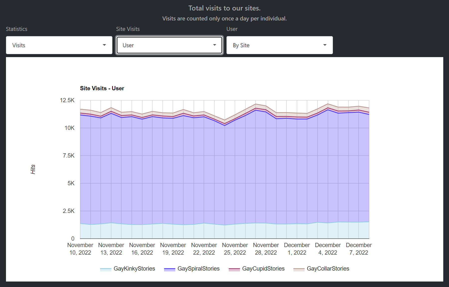
Unfortunately, none of these sites really caught on. As you can see on our site statistics page (select “User” in the drop down box “Site Visits”), none of those sites really got much traffic:
And that causes a problem for authors writing stories for these sites. Their stories just don’t get seen, don’t attract any attention and that is very frustrating to the authors. A classic Catch-22 situation.
So I decided, hesitantly, to change the logic.
Now by default all stories are going to be shown on all the sites. Including GaySpiralStories.
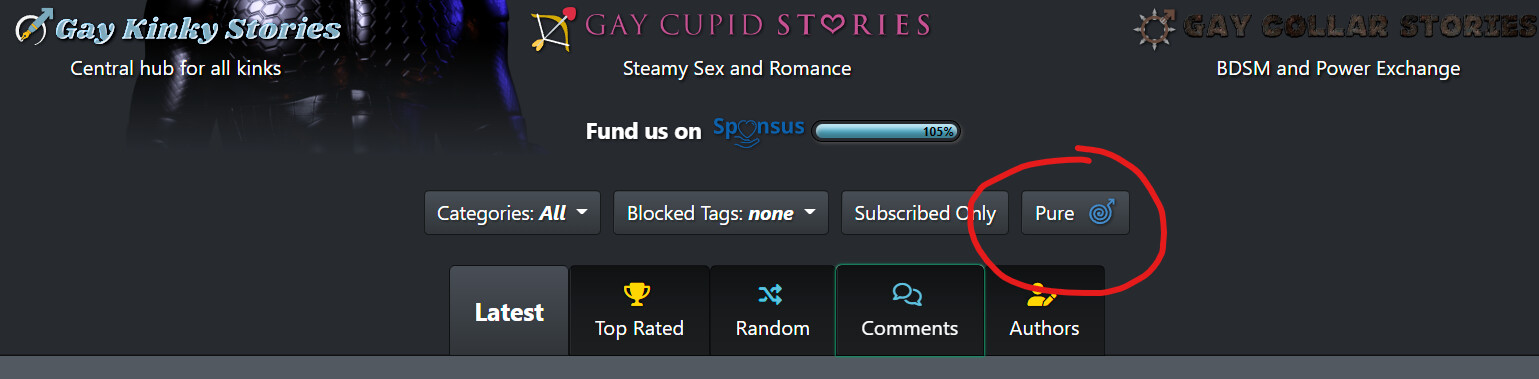
As that defeats my promise to keep GSS pure and unpolluted, I added an option to switch GSS (and also any of the other sites) back to the way they’ve worked previously. You just have to activate the “pure mode”:
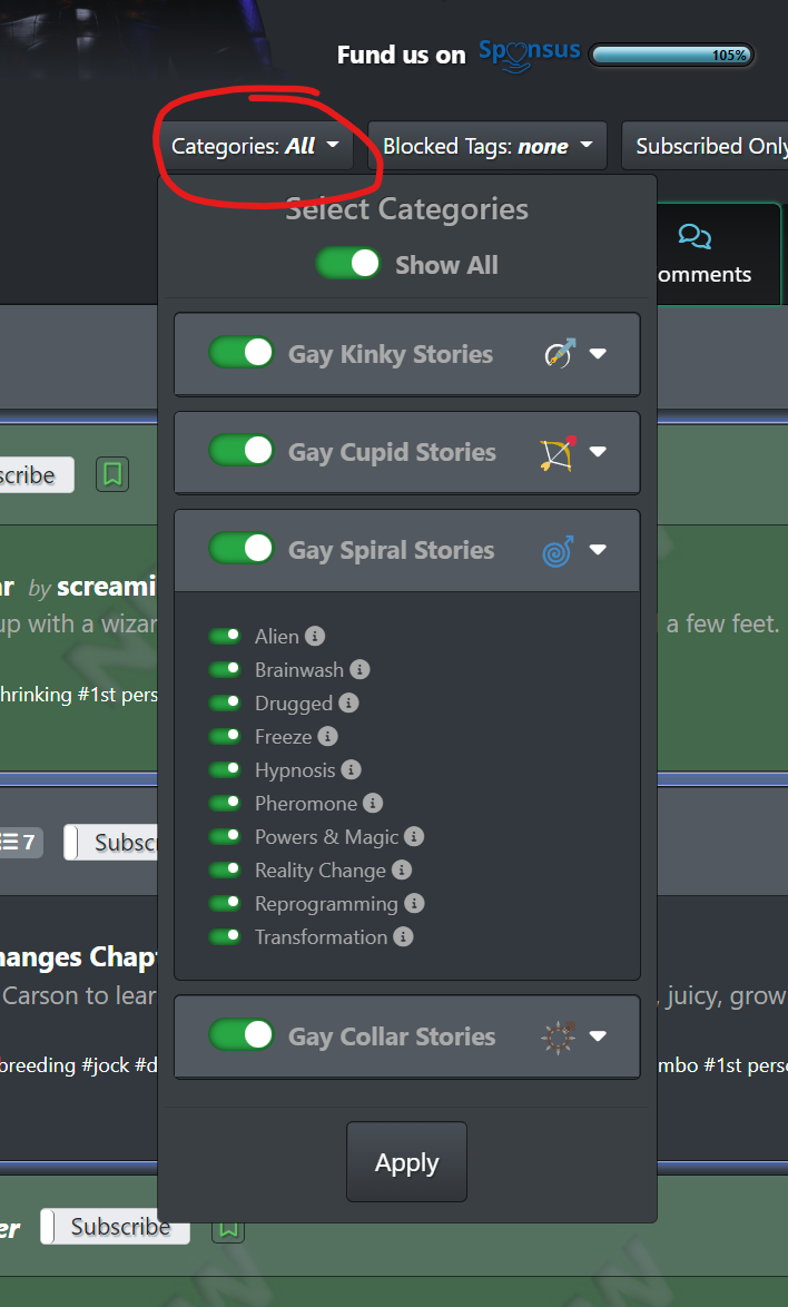
Also, you can still fine-tune which content you see with the “Categories selector”:
Note that this selector will look differently depending on whether the “pure mode” is toggled on or off.
Now each user has the option to go to any of the sites he feels most comfortable with and still gets the possibility to see all the content he’s interested in.
Also note that the site(s) which a story has been “targetted” for is still shown next to its category and tags. So even if you choose to get all the stories listed (which I recommend) you can still see at a single glance what this story’s focus is.
In general I would ask to be open to ANY content. Even if you’re into mind-control or transformation, be assured that there are great stories written for Collar or Cupid which might make you very exited, too.
Full change list:
Thanks for the comprehensive explanation of the new changes, Martin.
Is there a way to use the new filters to pull stories where the category/ies are either the primary or secondary option? (e.g. it’s a Kinky story, but it has Spiral as a secondary) I’ve just been having a try with the new filters and it looked like they were only referencing the primary
That’s true, they only select the primary site. BTW, while there can be “additional sites” for each story, there is always only ONE for each series. And that is also dependent on the selected primary site (i.e. if the author selected “Spiral” as the primary site, he also has to chose from one of Spiral’s categories).
Why would you want to select for the additional sites? Or do you want to get rid of them? Just let me know what your use case is so I understand better.
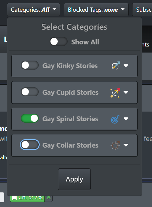
Oh, one way to make sure you only get the stories which have Spiral as the “primary site” is to use the category selector like this:
But really don’t want to recommend this, as you’d lose a lot of nice stories that way… ![]()
Current filter option will only show me stories where Spiral is the primary element. But I’m actually interested in any story which has Spiral involved, even if it’s the secondary element.
The old config for GSS pulled in both of those data sets. By excluding them from the new filters it’s actually going to give me fewer options, which feels like it’s the reverse of what you’re trying to achieve ![]()
Actually, that’s what you’re getting with the pure mode on Spiral. It will filter out everything which doesn’t have a Spiral reference at all (neither as primary nor as additional site). Any story which has Spiral at least as an additional site will show up.
Ah, great! When I was messing around with options earlier it looked like Pure was also removing those secondaries, but looking again now I see they are in there too. Thanks for confirming ![]()
I’ve added a mechanism that allows the site to recognize if somebody has read a story. If a user spends some time in the text body with his browser (the time depends on the length of the story) and scrolls all the way down to its end, the story will be counted as “read” by that user (happens at the same time when the reminder to rate appears on screen).
That has two advantages:
The author now not just only gets the number of hits for his story, but also the number of how many users actually READ the story. Note that each user is only counted once, even if he reads the story multiple times.
And the users get a little mark left to the stories and series notifying him, that he’s read the story already.
These are the symbols are shown next to stories and series to notify the user:
Note that on the “Latest” tab on the home page, the scope of the marks on series is all previously published stories (excluding the latest chapter, which is listed separately below).
So if there’s a ![]() or
or ![]() , you know that this is a series you’ve been following and are up to date, so it’s safe to read the latest chapter that has just been published.
, you know that this is a series you’ve been following and are up to date, so it’s safe to read the latest chapter that has just been published.
(This is a feature I really needed myself to help me get organized… ![]() )
)
Also note that the site started to track the stories you’ve been reading starting December 27th. So any story you’ve read before that date remains unread for this purpose. Which stories you’ve rated though is always tracked of course.
If I may make a suggestion, the system with all the badges is becoming way too complex.
Specifically, in the case of the read/unread stories, what is most relevant to a random user (say, myself) is whether the story was read or not. It doesn’t matter whether the story was added two hours ago or two years ago. It also doesn’t matter whether I’ve read some of the stories on the series or none of them. I just want some way to see which stories I haven’t read, or fully read, yet.
That being the case, I suggest the following:
Every chapter of a series must have been read in order for the series to be marked as read.
Rating a story or series chapter counts as having read the story or series chapter.
Adding a story or series to one’s favorites counts as having read it. In the case of a series, all existing chapters are marked as read.
Older stories or series chapters (i.e., published prior to December 27) are marked as read in a one-time transaction. This way, it won’t look like a user has tons and tons of unread stories.
Stories that are unread, and series where at least one chapter is unread are displayed with a lighter background (same as newly added stories). Drop the check marks.
As a bonus, I suggesting adding a filter that displays unread stories/series only.
With this scheme, a user can’t see which stories he has rated, but I don’t think that’s a big loss.
What do you think?
I think the basic issue is that there is so much crossover between the sites (e.g., power exchange stories with a strong mind control element) that the differences are relatively minor. This is especially true because the pool of authors and readers of all three sites is practically the same. I think you can check that yourself by querying the database.
Thank you for your constructive criticism and suggestions.
I agree that the fact that stories read before December 27th are not counted defeats the purpose a bit as of now. As I usually rate all stories I read, I’m less affected by this, but for people who only read but never rate, this new feature is less useful right now.
After a couple of weeks, this will resolve itself automatically unless an older series gets a new chapter.
My guess is that even if you see a hollow checkmark you might at least look at that series to see if you’d be interested in reading new chapters.
By the way, the checkmark itself is not new, it has been used for quite a while (two years or so) to mark rated stories. That you haven’t seen them is just an indication that you don’t rate (enough) ![]() . It hadn’t been used on series yet, though.
. It hadn’t been used on series yet, though.
Series containing at least one story marked as favorite will now also be marked (with a heart symbol), I forgot to mention that.
I’m afraid, using a lighter background wouldn’t be intuitive enough, and also, using even more colors makes the UI even harder on the eye as it already is. The checkmarks allow for a tooltip that shows up when hovering over an icon (or touching it), which at least could be used to give an understanding of what they stand for. But people could try to convince me otherwise here.
I’m not a fan of marking all older stories as read, as that would mean that almost all series and stories would get that mark - something I really don’t like. Especially as it would basically destroy the existing feature of seeing right away what you’ve already rated (the color difference between “read” and “rated” is rather subtle).
It would be possible to hide read stories/series. If there’s demand for that, I could add it.
Cross-over is a totally different issue for a different thread ![]()
If it were me, I just would lose all the sites and just go on with Kinky, where you can read it all in one place and filter out what you’re not interested in. However, I understand that there are loads of people who just want to get mind control and transformation stories, and don’t want to lose “their” GaySpiralStories. So we have to have to live with that compromise.
As an author, I definitely would not appreciate a feature which banishes all past stories to some sort of “ignore” pile (which is what marking them all as read regardless of whether they have actually been read would be in my opinion).
Older stories receive few enough eyes as it is, no need to make it worse for the very slight convenience it would offer.
There are some very, very good stories on this site that are from a long while back. I bet most readers have not read most of them.
I think my main issue with the checkmark is the proliferation of badges: the hollow/filled checkmarks in different colors, the heart badge, the bookmark badge, the highlighting of newly posted stories, etc. etc. It’s information overload and causes a reader to just ignore them or, worse, to misinterpret them.
Perfect example: a series that I’ve been reading had a new chapter posted today. There is a (hollow green) checkmark next to it. I immediately misinterpreted it as having read the series and only reassessed when I remembered that the entry was highlighted when I first pulled up the site.
At some point, more becomes less.
Regarding older stories, I agree with @amul that their status is problematic but I don’t see a clear solution.
Anyway, I’m not programming the site, just enjoying the content and very occasionally contributing content, so I understand that my opinion has limited weight. Take it for what it’s worth.
I’m aware that the UI is packed, some might say convoluted. I don’t see any way to resolve this, because I - and many other users - appreciate all the info presented.
But, of course, if you’re new to the site, you can be overwhelmed and some people just don’t care about the into.
I’ve already thought about offering a stripped down theme, which hides some elements. But which elements should be hidden, which should remain? I think it’s very dependent on personal preferences what you want to see and what not.
I hope people will get used to the new checkmark. You might be confused at first, but not the second time you see it. As with all things, it’s a matter of experience.
Again, I understand your issues. I just don’t see a good solution. There isn’t a single information I would like to see dropped myself… everything is helping me to cope managing the sheer amount of stories posted. Actually, that’s exactly why I added that new feature, as I failed to remember which series I’m following - and because of that I stopped reading new chapters of series I was actually interested in.
If you are inviting feedback on this, Martin, I have some for you! I am one of the people that thinks the site has become a tad too “busy” with all the additions, and I’ve actually been thinking for a while now that a solution to this would be to offer a “basic” theme. I understand some people like the site as it is, so adding it as a theme means people can opt into it if they like, but aren’t forced to do so.
Now, I know almost nothing about how these things work behind the scenes, so maybe it’s not possible to have a theme that removes entire elements. If it is possible, however, I think a great place to start would be removing the avatar pictures from the main story list. When scrolling through stories, I often find my eye is drawn to the pictures on the left, but since this tells me literally nothing about the story itself, it serves only as a distraction. And since anyone can have anything as their picture, you get all sorts of different images as you scroll, with all sorts of different color schemes, which I think definitely adds to the visual bloat.
Keeping the images on the individual profile pages is fine, but I think removing those from the main directory would be a good start for any stripped down mode.
It’s actually really simple to offer a theme that hides certain elements. The question is more, WHICH elements to hide.
I’ve actually started to implement some mechanics where you could selectively disable elements. But at the end I stopped, because it quickly became crazy. I mean, this is a wanking site, and giving the user the option to switch off/on each UI element separately was totally overboard.
And your example is also a great example. For me, the avatar image give the author and his stories personality. I often remember the avatar visually and immediately, better than the author’s name, and know what to expect. I’m pretty sure I’m not alone with that. There is a reason that avatar images are really common in modern social systems, like everywhere.
One person might despise the rating badges and would love to be able to turn them off. The next guy would never use bookmarks and want to disable those controls. Then others have no use for the read and rated marks…
So I might add a very basic theme that turns off about everything (probably with the exception of the avatars though… not to spite you, but because I think they’re really making a difference). But I’m almost sure that people will start to ask me to enable this or that while leaving the rest disabled.
Another compromise would be to remove the avatar from the classic table views (like on the “List all series & stories” page where the old paging interface is still available).
The message is: There is just no pleasing everyone. And too many options are not good either, for various reasons (one of them being the additional test efforts… it’s already crazy as it is).
I’m also a visual person and when people switch their avatars around frequently or have no avatar it makes it hard for me to sustain an impression of that person behind the account.
For some people avatars are pointless, whereas I would never turn them off.